Conversions are a vital metric within digital marketing campaigns, and several key factors influence the way users view your site, behave on it and, ideally, convert into purchases. One top example: The realm of web design, which is often vital for driving conversions.
At BWP Communications, we’re proud to offer an unmatched range of web and app design services for clients around Salt Lake City, Utah and nearby areas, plus numerous other digital and print marketing solutions. Here are some of the basics on web design’s impact on conversions, discussing some of the vital ways quality web design drives desirable user behavior and eventual purchase conversions.
Web Design is More Than Just Aesthetics
While it’s true that web design sets the aesthetic foundation for your website, it is much more than just the visual appeal. In fact, web design plays a crucial role in how users navigate and interact with your website, ultimately influencing their decision to convert into customers.
One of the main ways web design affects conversions is through its impact on user experience (UX). A well-designed website should be easy to navigate and offer a seamless browsing experience for users. This means a clear and intuitive layout, easily accessible information, and fast loading speeds.
Relationship Between UX and Conversion Rates
User experience is directly connected with conversion rates. If your website is difficult to use or cluttered, users are more likely to leave without converting. On the other hand, a positive UX can lead to higher conversion rates and increased customer satisfaction.
Some key aspects of UX that affect conversions include:
- Navigation – A clear and user-friendly navigation menu makes it easy for visitors to find what they are looking for. This can reduce frustration and increase the likelihood of conversions.
- Page Speed – According to research, 53% of mobile users will abandon a website if it takes longer than three seconds to load. Slow loading speeds not only impact user experience but also lower your search engine rankings.
- Mobile Optimization – With more and more people accessing websites on their mobile devices, it is essential to have a mobile-friendly design. This includes responsive design, easy navigation, and optimized content for smaller screens.
- Forms – Forms are often used to gather information or capture leads from website visitors. It is important to keep forms simple, easy to use, and relevant to the user’s needs.
- Call-to-Action (CTA) – A CTA is a prompt that encourages users to take a specific action such as “Sign up now” or “Learn More”. A well-designed CTA can significantly impact conversions and should be placed strategically throughout the website.
Psychological Principles and Design Elements to Influence Conversions
When it comes to designing a website that encourages conversions, there are several psychological principles and design elements that can be utilized to influence user behavior. These include:
- Social Proof – People tend to follow the actions of others, so displaying positive reviews or testimonials from satisfied customers can boost credibility and trust in your brand.
- Urgency/Scarcity – Creating a sense of urgency or scarcity through limited time offers or low stock notifications can generate a fear of missing out (FOMO) and prompt users to take action.
- Emotional Triggers – Emotions play a significant role in decision-making, so incorporating emotional triggers such as fear, excitement, or exclusivity into your messaging can persuade users to convert.
- Personalization – Tailoring your messaging and offers to specific demographics or individual preferences can make users feel valued and more likely to convert.
- Convenience – Making the buying process simple and hassle-free can reduce barriers to conversion. Providing multiple payment options, free shipping, or a one-click checkout can improve the overall user experience.
- Consistency/Brand Identity – Consistently delivering a cohesive brand message and identity across all channels can build trust and familiarity with your audience, making them more likely to convert.
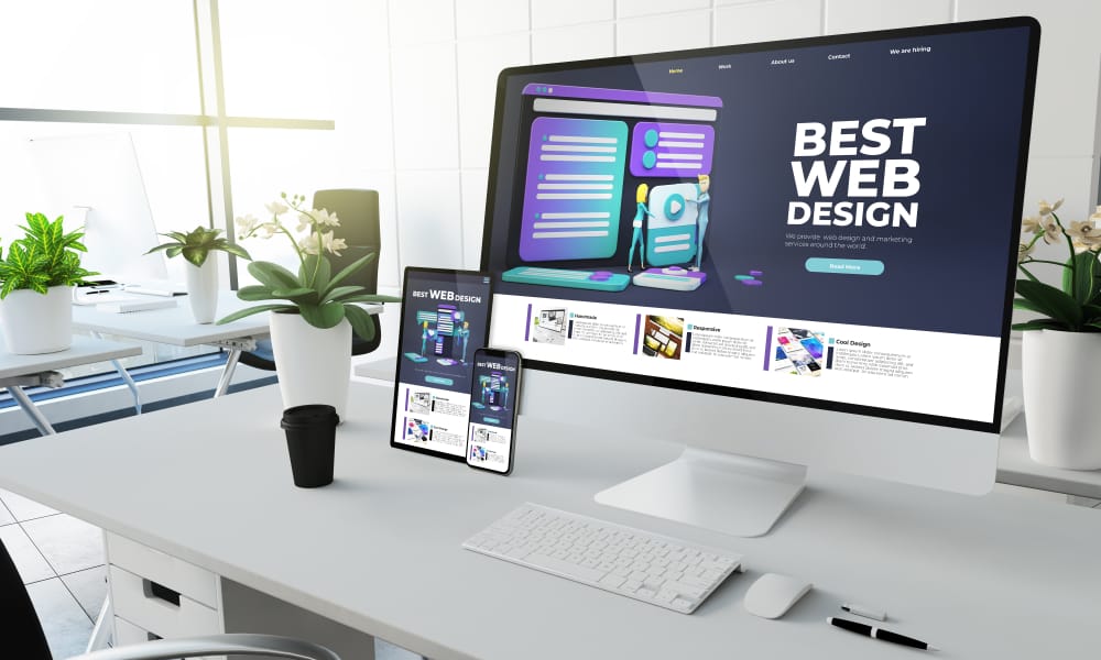
Mobile and Responsive Design Concepts
As more and more people access the internet through mobile devices, it is crucial for businesses to ensure their website is optimized for mobile and has a responsive design. This means that the website should adapt and display properly on any device, regardless of screen size.
Having a mobile-friendly website has become imperative for businesses as it not only improves user experience but also helps with search engine optimization (SEO). In fact, Google considers mobile-friendliness as a ranking factor in its search algorithm.
A few ways to make your website more mobile-friendly include:
- Using a responsive layout: This allows your website to adjust its layout according to the screen size of the device it is being viewed on.
- Optimizing images and videos: Large or high-resolution images and videos can slow down the loading speed of your website on mobile devices. Optimizing them for smaller screens can make a significant difference.
- Implementing touch-friendly buttons: Mobile users rely heavily on touchscreens, so it’s important to have buttons that are large enough and spaced apart to make it easy for users to click on them.
- Simplifying navigation: Mobile screens are much smaller than desktops, so reducing the number of menu items and using drop-down menus can make navigation easier for users.
- Including clickable phone numbers and email addresses: This allows users to easily contact you without having to manually copy or type in your contact information.
At BWP Communications, we’re happy to help with all your web and app design needs. Contact us today for these or any of our other marketing services to businesses around Salt Lake City, Utah!